


Bitcoin’s long-term price history reveals a striking and often overlooked pattern. Despite multiple deep drawdowns and prolonged bear markets, Bitcoin has never recorded two consecutive red yearly candles.
Each losing year has historically been followed by recovery, reinforcing the asset’s cyclical structure and long-term resilience.
The chart tracks Bitcoin’s annual performance from 2011 through 2025, clearly separating green (positive) and red (negative) yearly closes while also displaying annual trading volume.
Red Years Have Always Been Followed by Recovery
Across more than a decade of data, every red year stands alone. Periods of weakness in 2014, 2018, and 2022 were each followed by a green year, often with strong upside momentum.
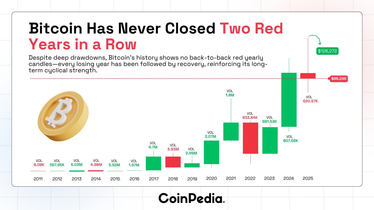
This pattern suggests that prolonged downside phases tend to reset market structure rather than signal long-term failure. The absence of back-to-back red yearly candles highlights Bitcoin’s tendency to transition from contraction to expansion once selling pressure exhausts.
Recent Cycle Context: 2024 vs. 2025
The chart shows a powerful green candle in 2024, with Bitcoin reaching approximately $126,272, accompanied by notable volume expansion. In contrast, 2025 is currently marked as a red year, with price shown near $88,296 and lower relative volume.
This shift reflects a cooling phase after a strong advance rather than an unprecedented breakdown. Importantly, the historical pattern displayed in the chart suggests that a single red year has never extended into a second consecutive annual loss.
Volume Trends Reinforce Cyclical Behavior
Annual volume figures shown beneath each candle add important context. High-volume green years often follow periods of compression, while red years typically occur alongside declining or moderating volume.
This behavior supports the idea that Bitcoin moves in cycles of accumulation, expansion, distribution, and correction, without lingering indefinitely in contraction across multiple years.
What the Pattern Implies
Based solely on the historical data presented in the chart, Bitcoin’s yearly structure favors recovery over prolonged decline. While short-term volatility and drawdowns remain part of the asset’s nature, the absence of consecutive red yearly closes underscores its long-term cyclical strength.
If the historical pattern holds, the current red year would be consistent with previous reset phases rather than a structural break in Bitcoin’s market behavior.


